APPROACH
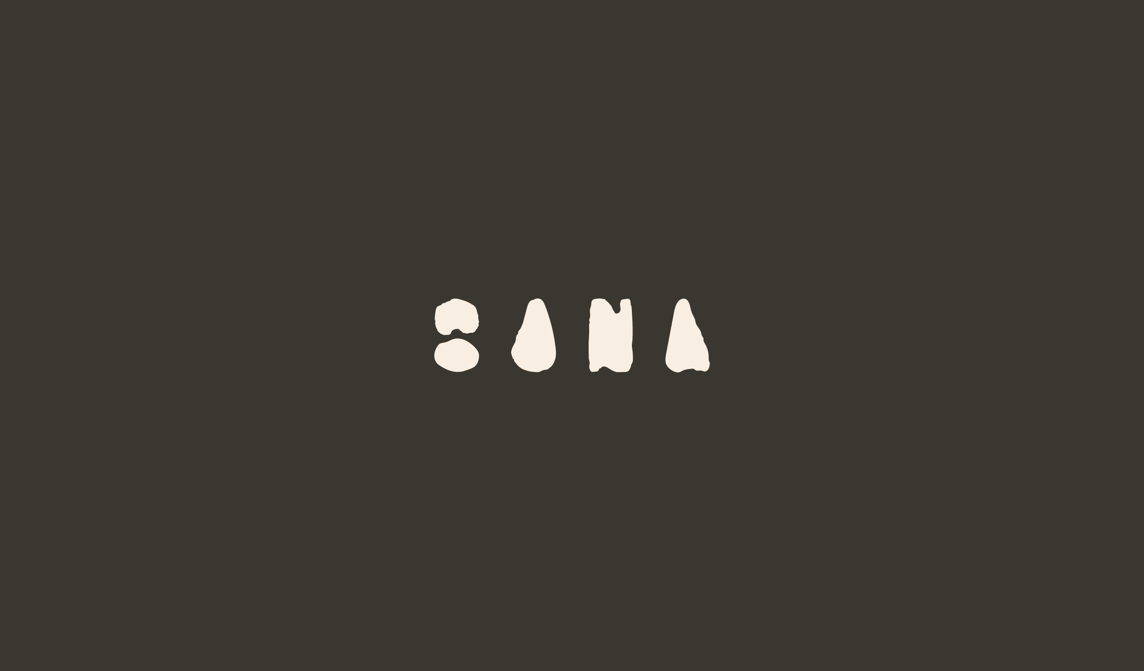
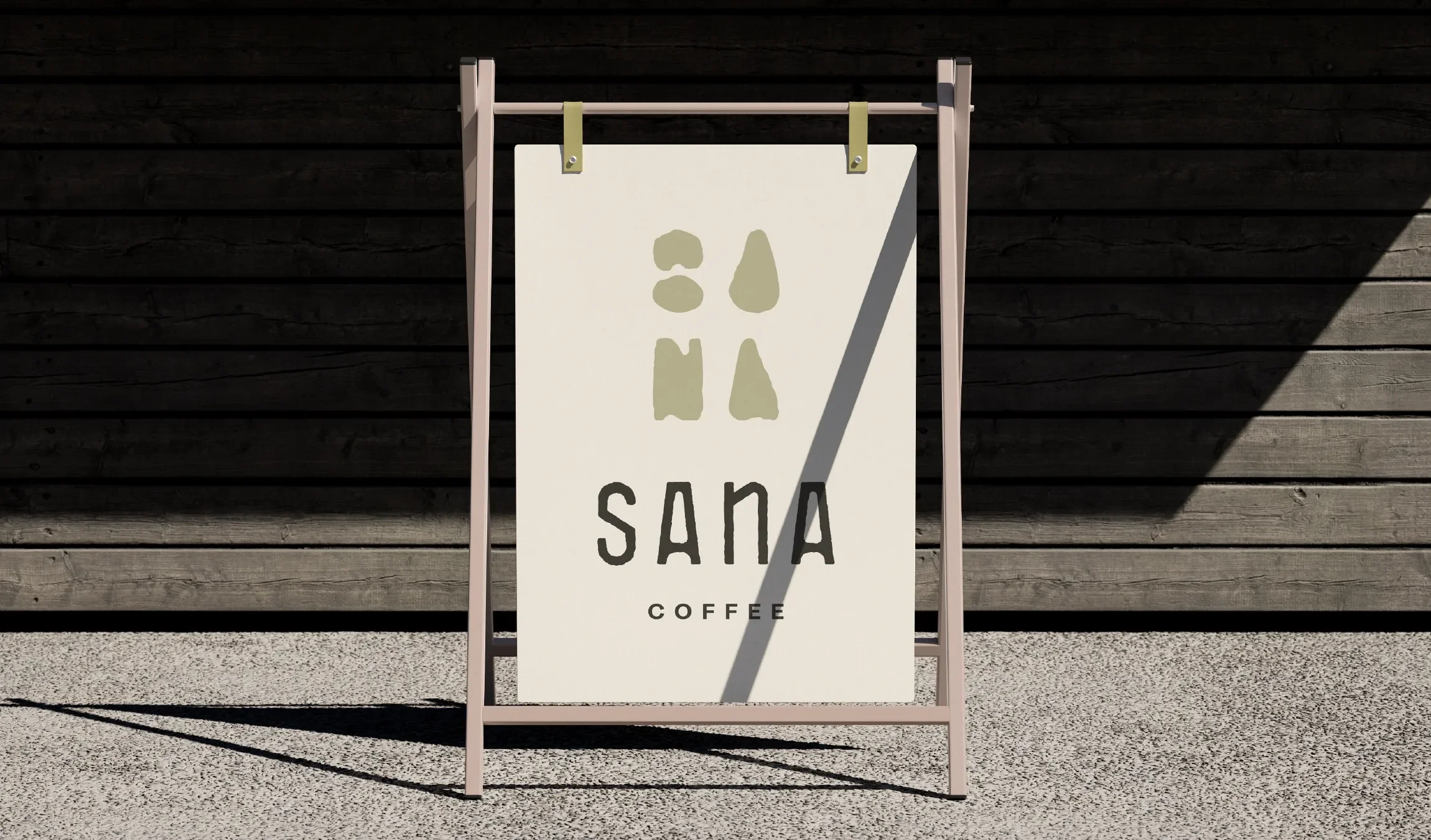
The brand is built around the idea of balance and calm through contrast. Drawing from the meaning of Sana — calmness and serenity — the identity embraces a sense of duality: slow moments within fast days, simplicity paired with depth, and warmth layered with restraint.
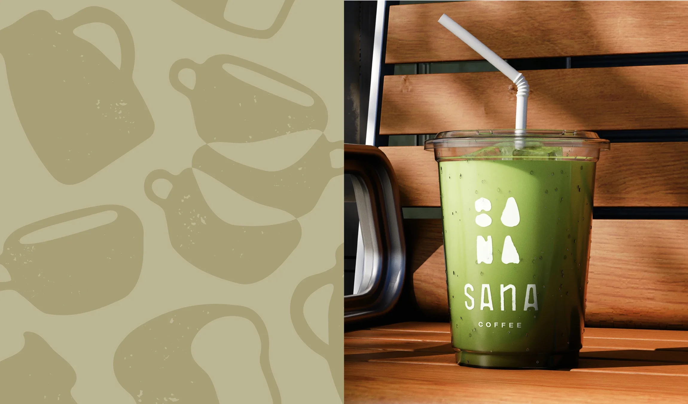
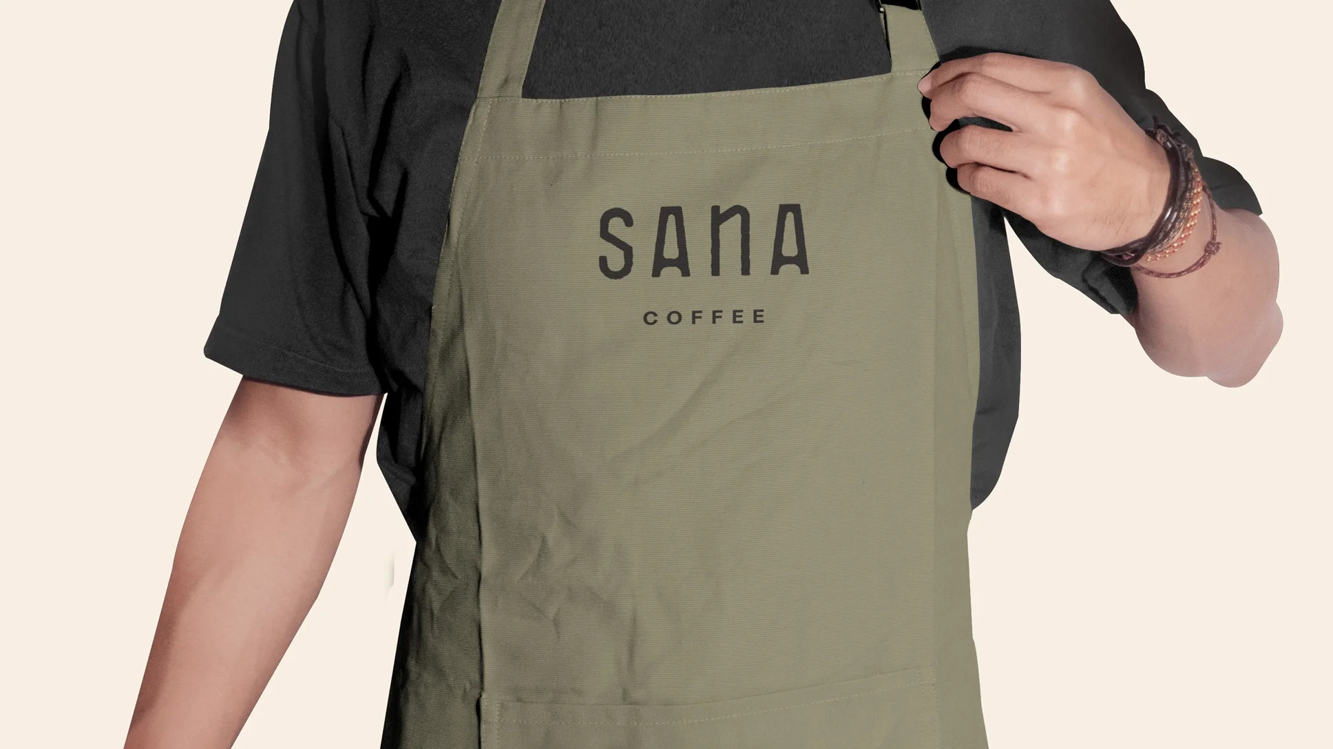
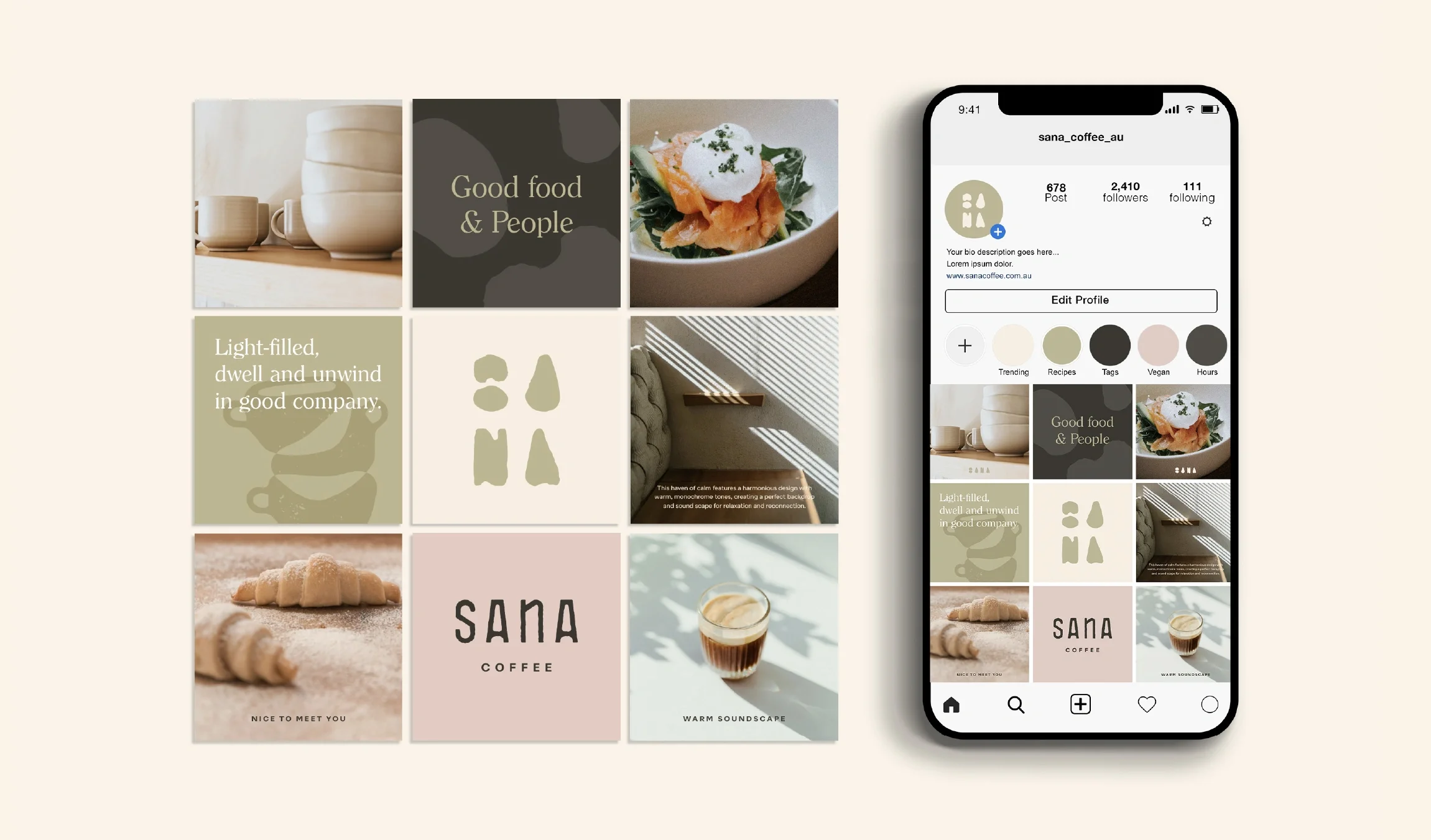
Visually, the branding combines minimalist, Japanese-inspired cues with tactile warmth and human softness. Clean typography and uncluttered layouts are offset by natural textures, warm tones, and subtle sensory references. The tone of voice is relaxed and welcoming, avoiding trend-driven language in favour of something more enduring and grounded.
Every brand element is designed to support ease — easy to enter, easy to order, easy to stay — reinforcing Sana as part of the neighbourhood’s daily rhythm rather than a destination reserved for special occasions.