Bintan Lagoon International Golf (BLG)
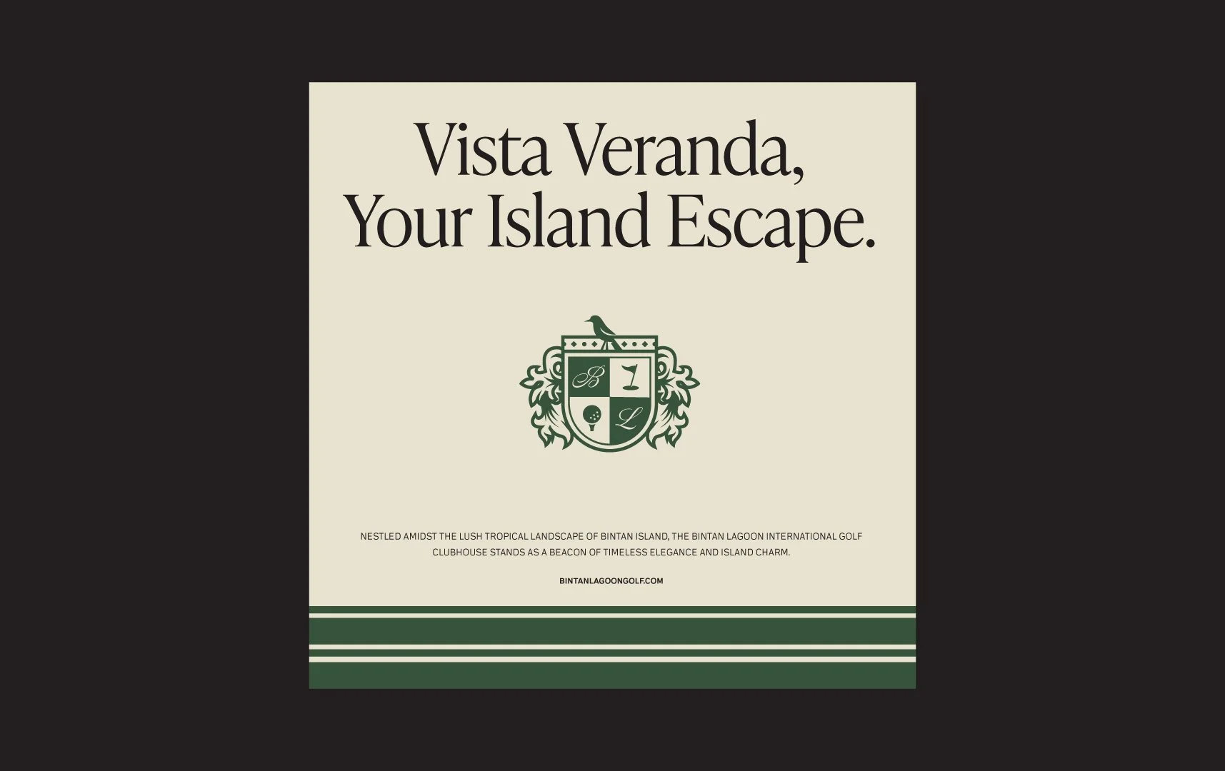
Vista Veranda,
Your Island Escape
Hospitality & Entertainment
Strategy, Branding, Collateral, Website, Signage

BRIEF
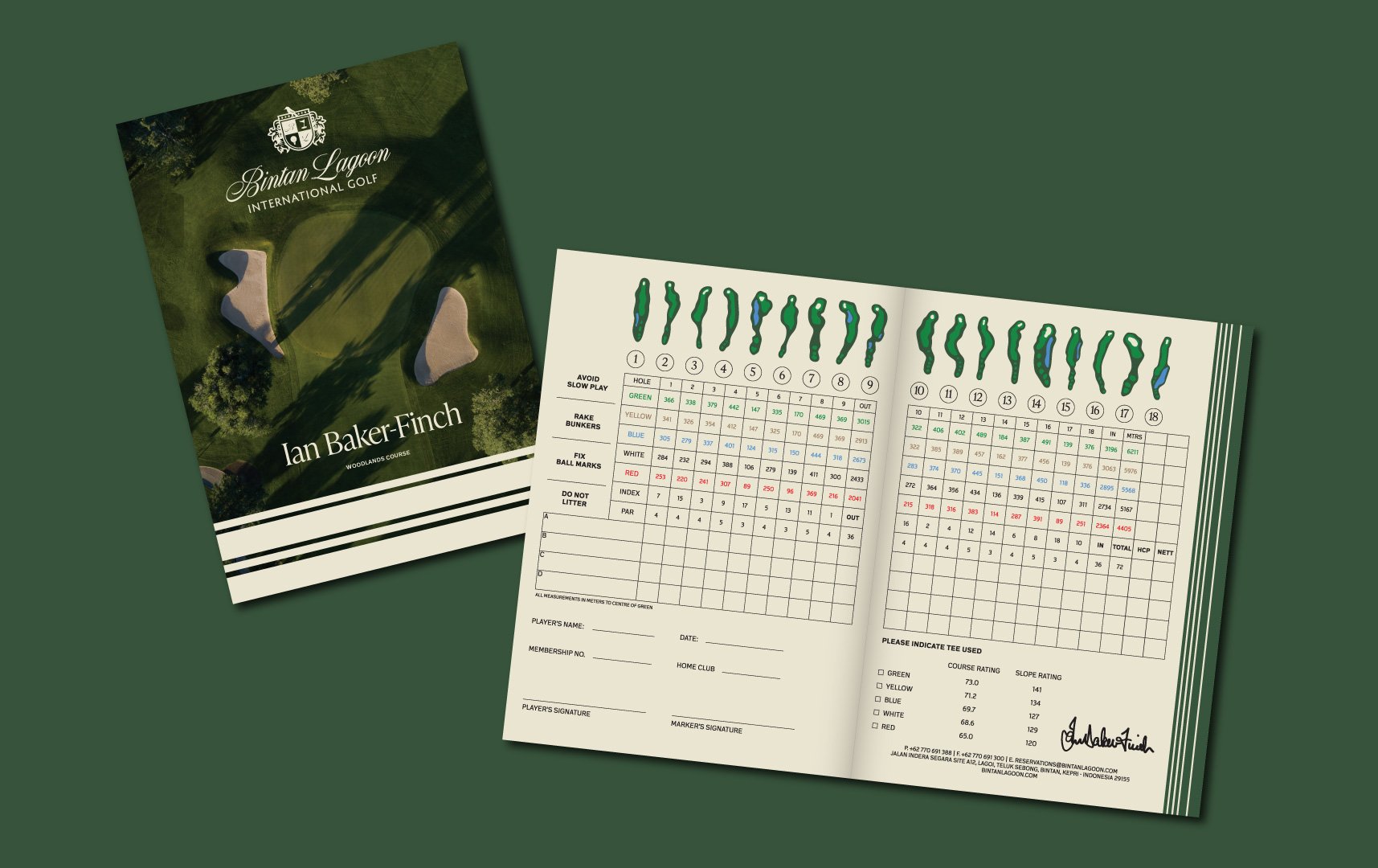
Bintan Lagoon International Golf is a reimagined destination on Bintan Island, home to championship courses designed by legends Jack Nicklaus and Ian Baker-Finch. More than a golfing retreat, it offers an elevated lifestyle experience—balancing world-class sport, culinary exploration, and resort-style leisure. The clubhouse concept, Vista Veranda: Your Island Escape, rechanneling Home Far Away from Home, positions BLG as both a sanctuary and a social hub, where timeless elegance blends with the island’s lush natural beauty.
APPROACH
Our challenge was to craft a brand that felt premium yet inclusive, reflecting both Bintan’s heritage and the aspirations of a modern international audience, through a brand refresh. Anchored in the idea of an “all-in-one destination,” the brand was built around warmth, refinement, and confidence—delivering comfort without losing exclusivity. The visual identity drew inspiration from classic Western golf aesthetics, blending natural greens, creams, and navy with emblematic motifs of Bintan’s landscape and wildlife. Every touchpoint, from typography and signage to apparel and golf scorecards, reinforces the elevated yet approachable tone.


OUTCOME
The result is a brand that reframes Bintan Lagoon International Golf as more than a clubhouse—it’s a sanctuary where nature, luxury, and leisure flow together seamlessly. Visually, the brand system takes inspiration from Bintan’s natural environment: the greens of rolling valleys, the cream tones of sand and stone, and the deep navy of the surrounding sea. These colors, paired with refined and classic typography, combined with vintage golf aesthetics, create an identity that feels premium yet approachable.
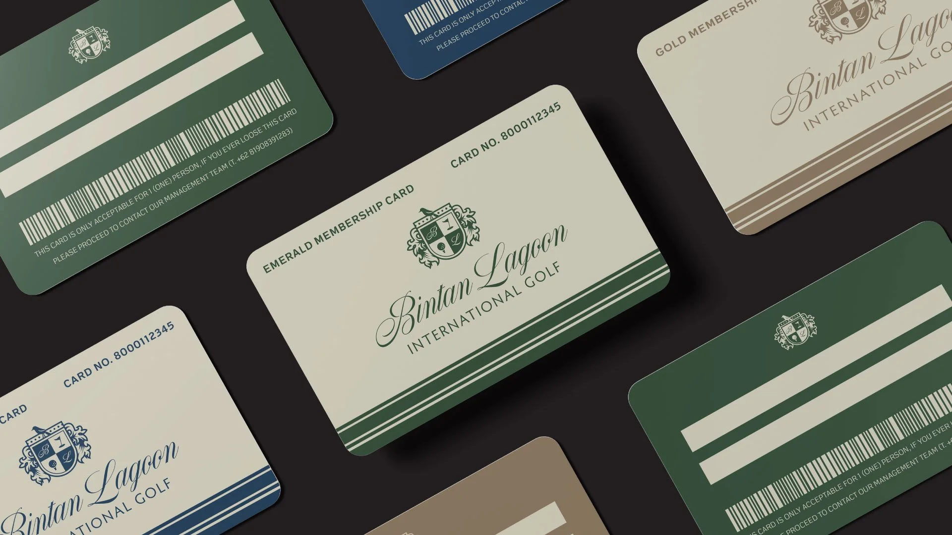
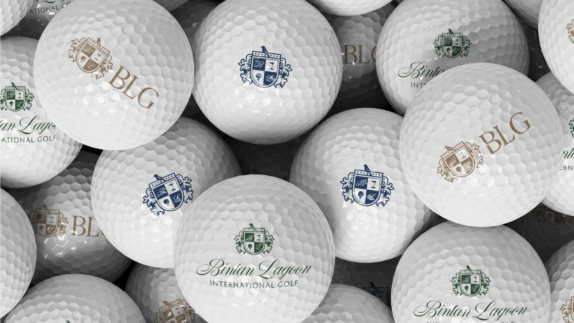
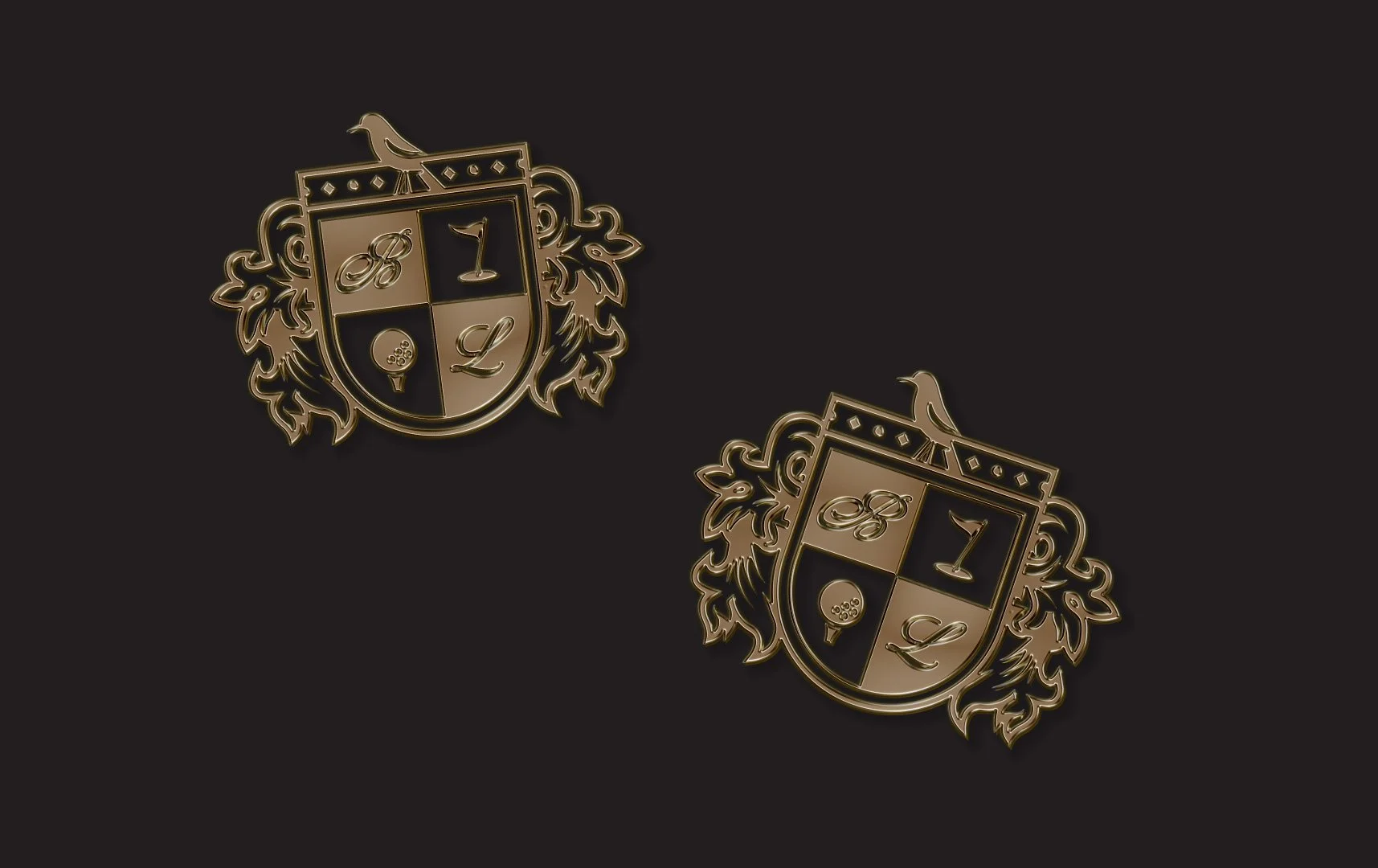
At the heart of the identity lies the emblem: a timeless crest blending the initials “B” and “L” with motifs of flora and the kingfisher bird—commonly seen across the courts area, and symbolizing agility, grace, and precision. This crest extends across polo shirts, caps, scorecards, and signage, ensuring the brand is not only seen but experienced in every detail.
The collateral touchpoints reinforce the brand promise: an all-in-one destination where every swing, meal, and moment is designed for connection and memory-making. By blending timeless elegance with the spirit of an island escape, BLG has become a place where both the world’s finest and leisure seekers play, and every guest leaves with a story worth telling.