TYGA (Branding)
Strategy, Branding, Collateral. Interior
BRIEF
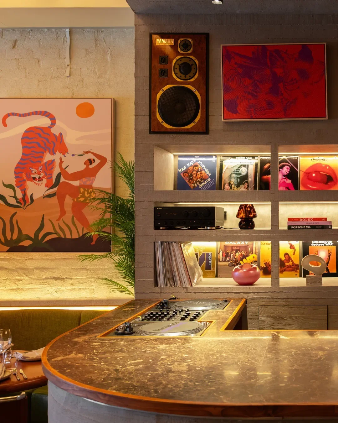
TYGA required a bold, retro-modern brand identity that could match the venue’s 70s Bangkok–inspired interiors while standing confidently as a neighbourhood hospitality brand on Koornang Road. The client sought a playful yet refined brand system that felt “Stylo Milo!”—cool, charismatic and instantly recognisable across signage, menus, uniforms, merch and digital touchpoints. The brief emphasised capturing Southeast Asian nostalgia, music culture, cocktail energy and an effortlessly stylish dining personality.
CHALLENGES
A major challenge was creating a brand system flexible enough for multiple programmes—lunch, dinner, cocktails, DJs—without losing coherence. The identity also needed to harmonise with the interior's strong cherrywood and emerald scheme while remaining distinctive. Achieving an iconic logomark that felt both “retro Asian” and “Carnegie-cool” required extensive exploration of type, monograms and cultural cues.

OUTCOME
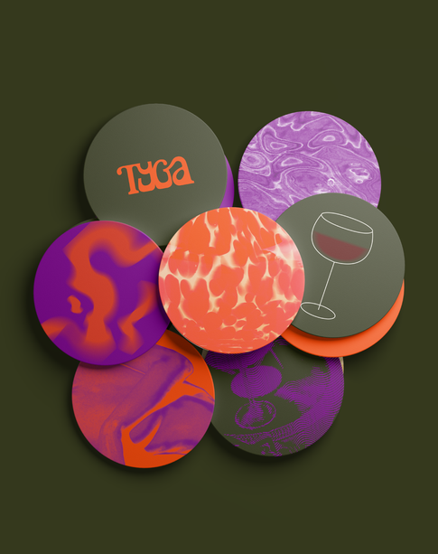
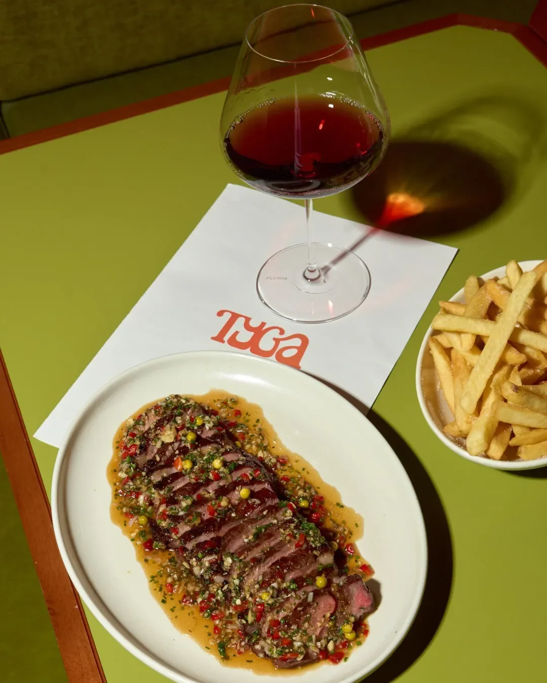
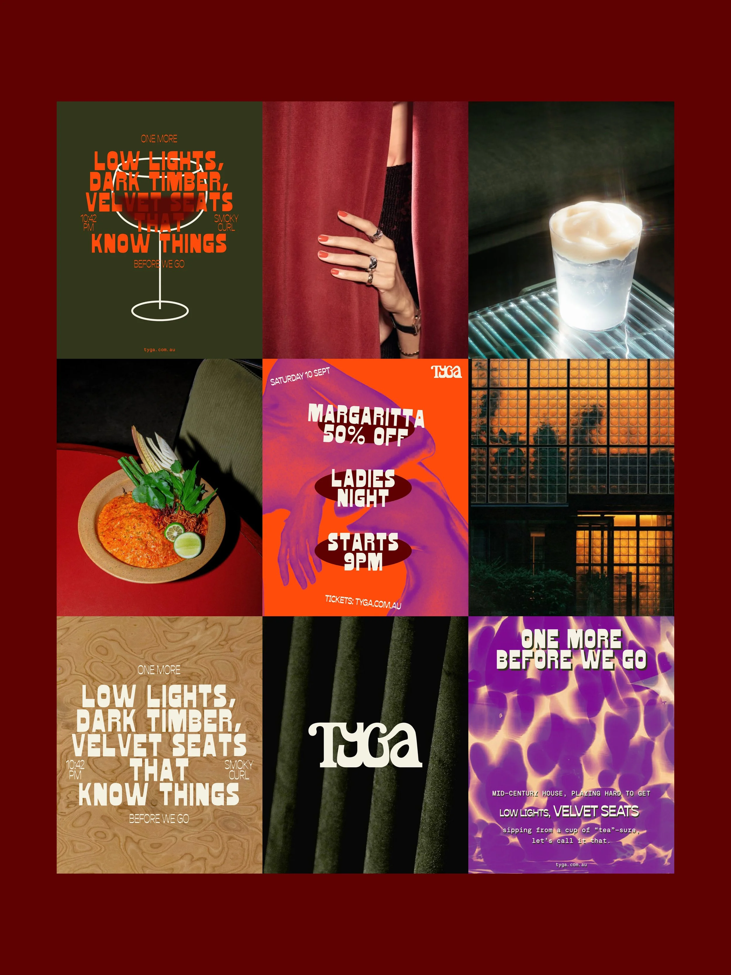
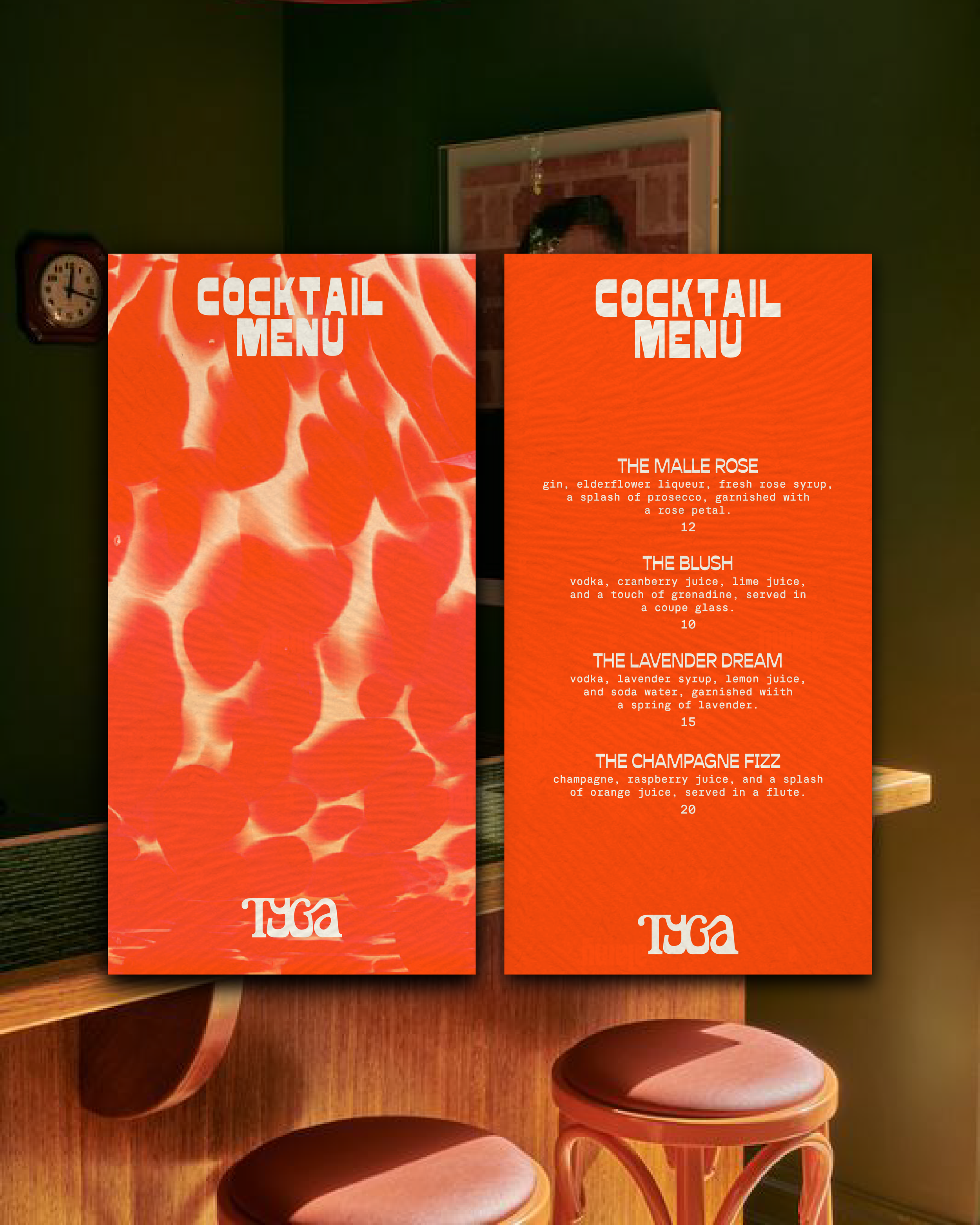
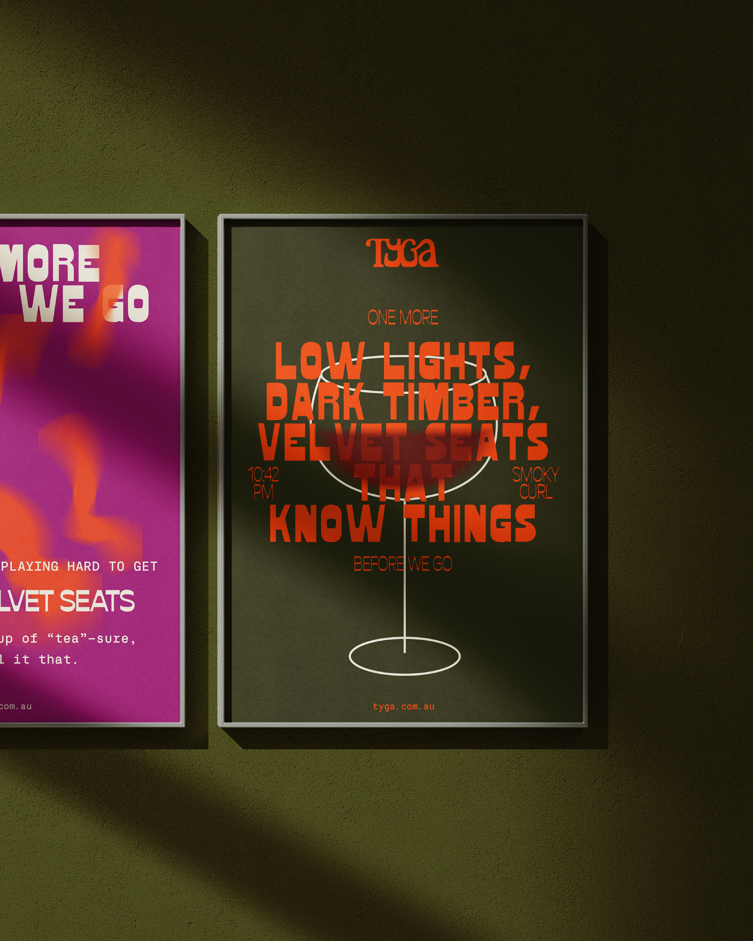
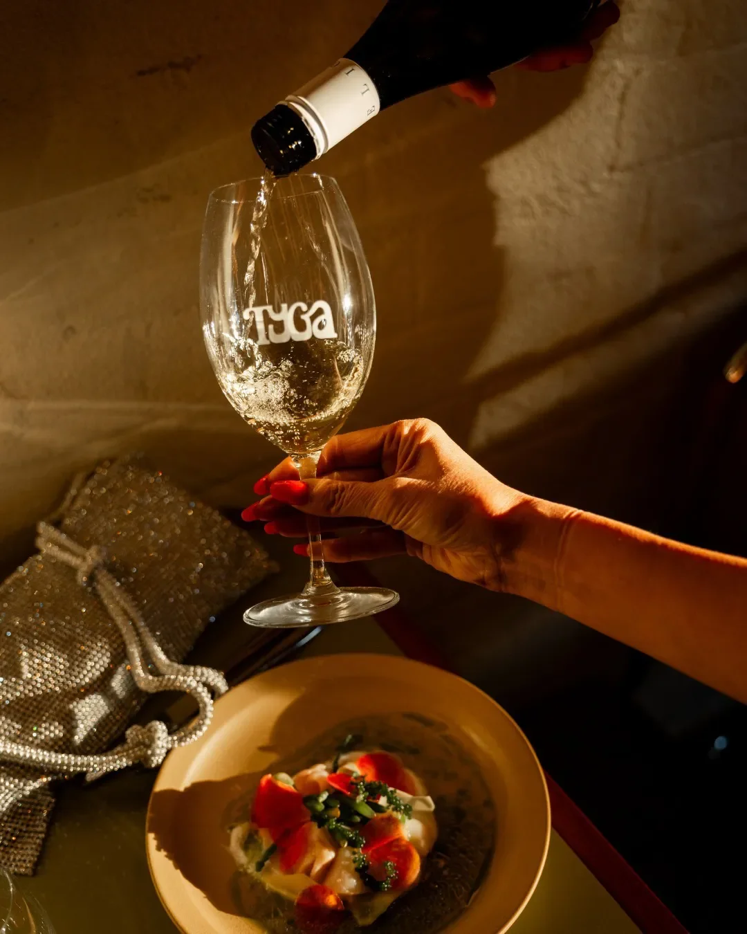
Building from the approved Bangkok Funk concept, the branding approach fuses mid-century confidence with a cheeky, modern spirit. The primary logotype—an expressive, custom-styled wordmark—embraces movement and retro curves, echoing 70s Asian glamour. Paired with structured supporting typography and a vibrant palette of burnt orange, deep olive, purple jewel tones and smoky neutrals , the identity balances nostalgia with contemporary freshness. Photography direction evokes sultry moods, velvet textures, playful hands, vintage cocktails and warm amber moments, reinforcing TYGA’s late-night charm.