Frenchie (Interior)
Strategy, Branding, Collateral. Interior
BRIEF
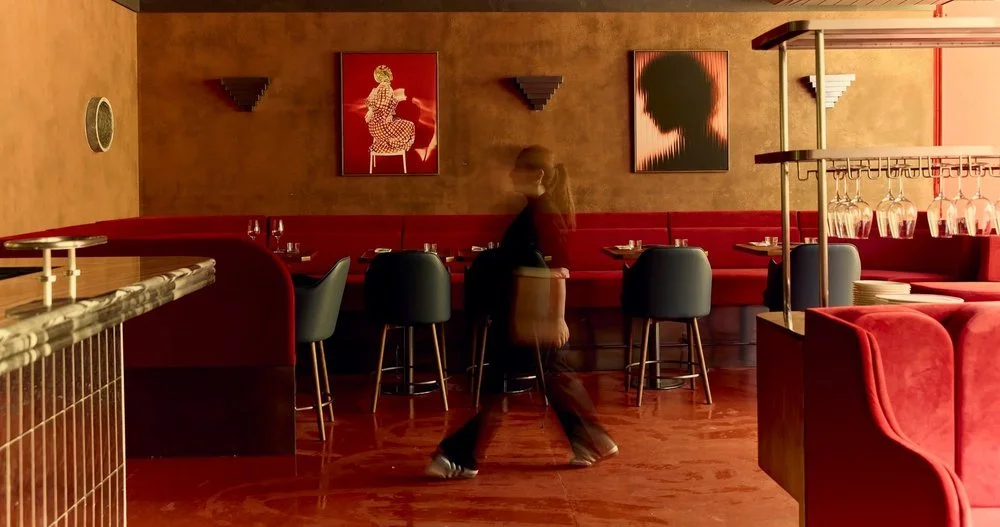
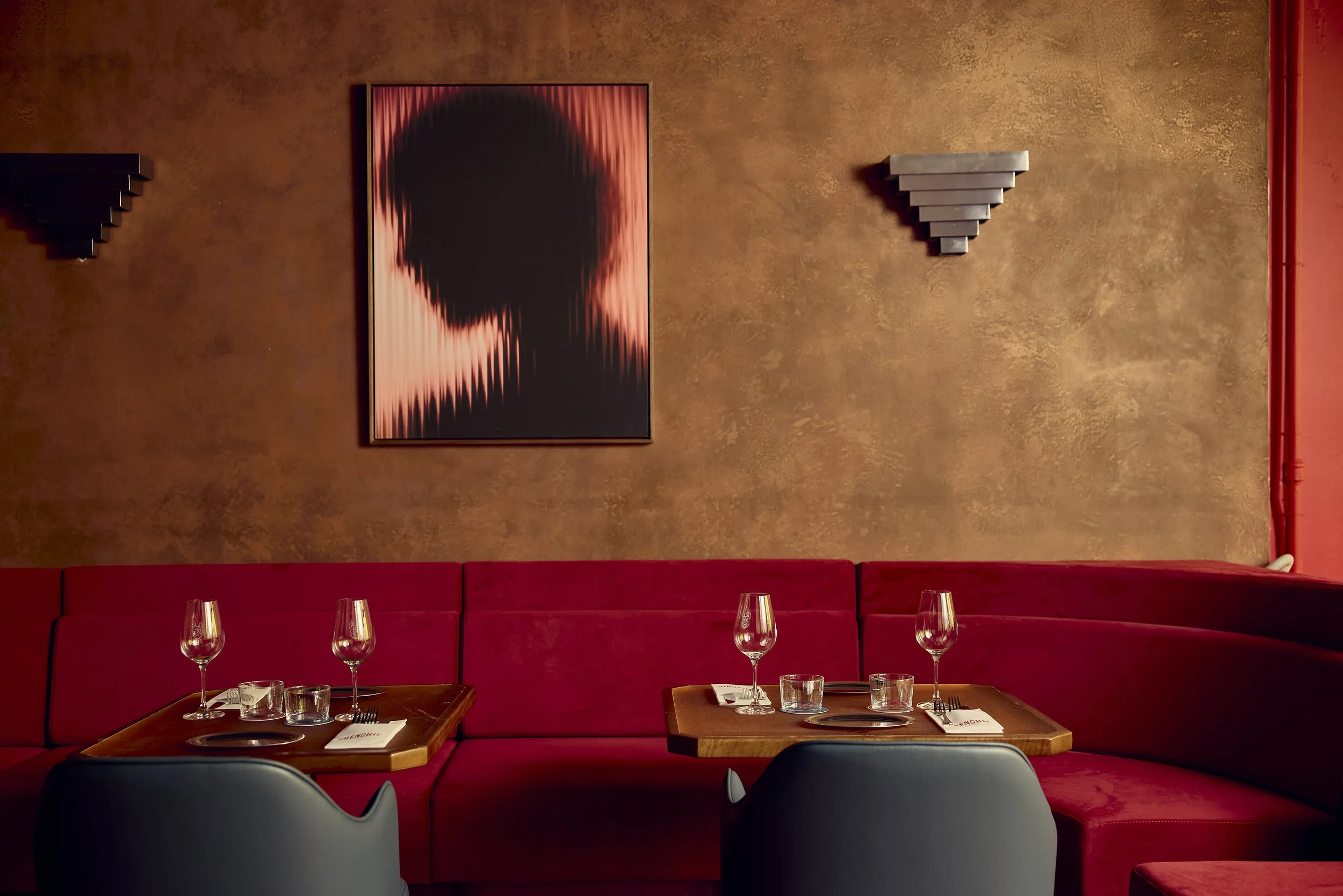
Frenchie reimagines the spirit of Paris’s Pigalle district through a contemporary branding lens, capturing the tension between romance and rebellion that defines its after-dark identity. Inspired by the raw glamour of 1960s French New Wave cinema and the underground energy of Paris’s historic red-light and music quarters, the brand balances elegance with attitude. Moody tones, provocative details, and playful irreverence shape a visual world that feels both nostalgic and electric. Designed as a modern French speakeasy for Melbourne, Frenchie’s identity reflects indulgence without formality, a place where cocktails flow, rules soften, and every night carries the promise of something unexpected.
APPROACH
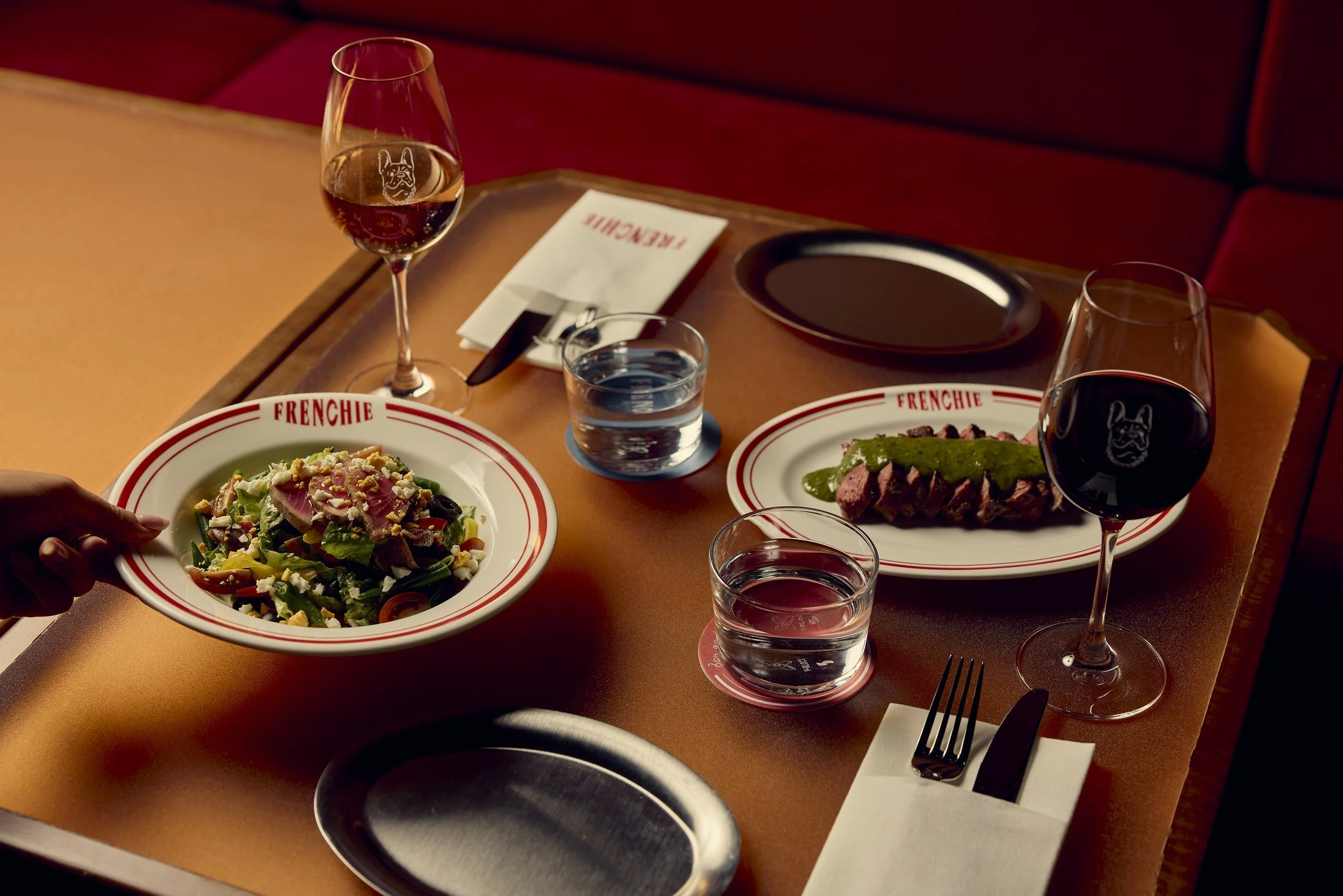
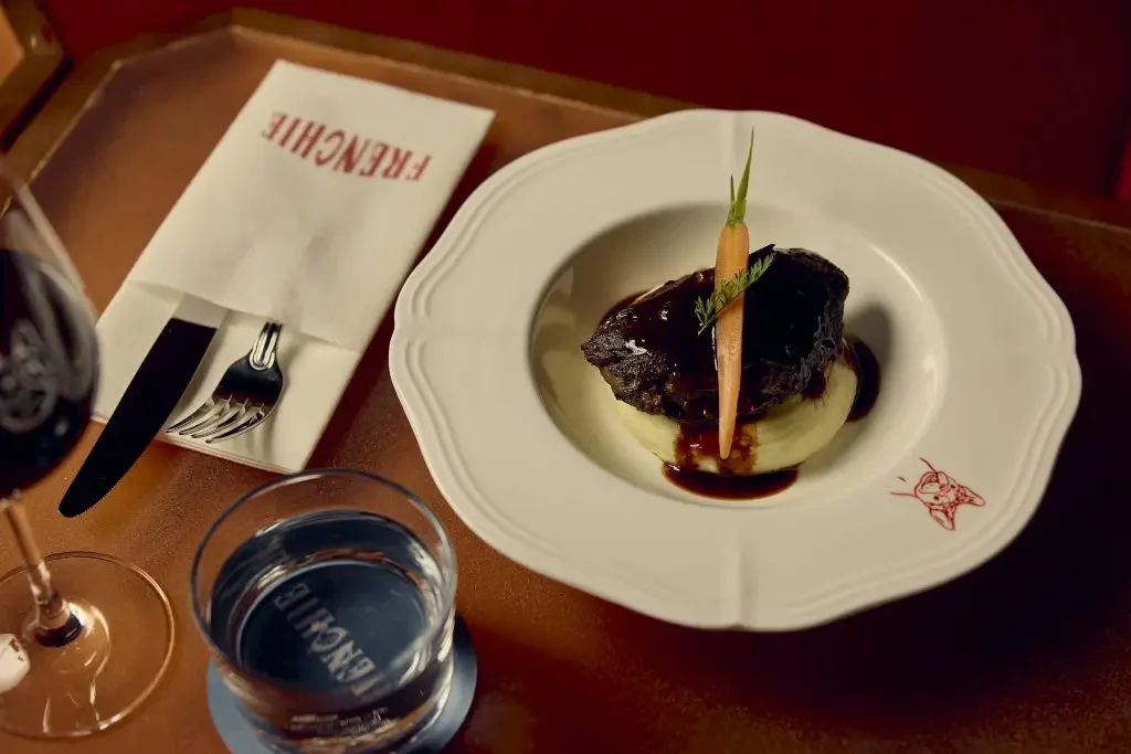
Frenchie dials Paris up and prices it down. The brand lives at the intersection of grit and glamour, where Pigalle’s after-dark pulse meets the accessibility of a $14 plate. Classic French flavours are reimagined in a fast-paced, social format - foie gras without the formality, steak frites without the ceremony, indulgence without intimidation. Cocktails follow suit: timeless French classics with a twist, designed to be ordered quickly, enjoyed freely, and repeated often. This is not hushed, white-tablecloth dining. It’s rebellious chic made democratic. Shapes Frenchie as a space where luxury sheds its stiffness and flavour takes centre stage.
OUTCOME
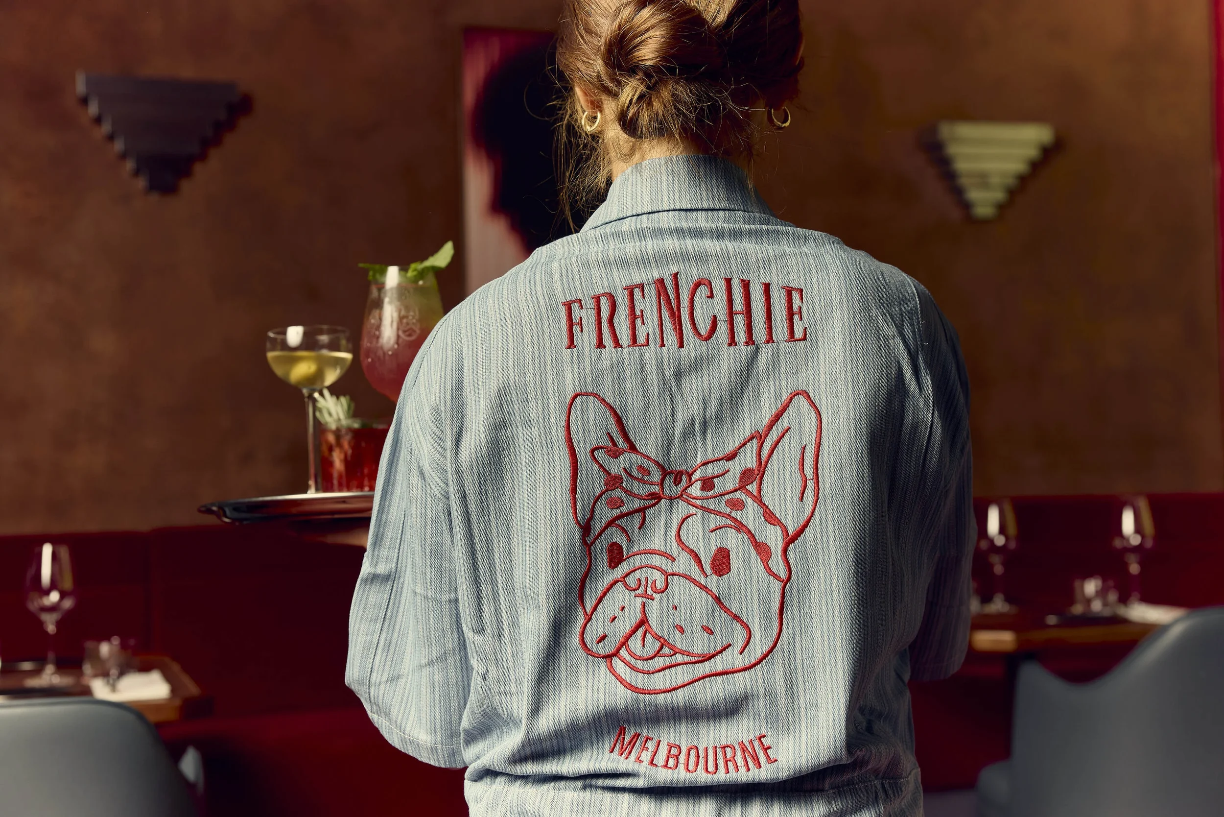
The name “Frenchie” captures something playful and affectionate, a wink to Paris without the pretension. It feels familiar yet charged with attitude, much like the venue itself. Short, punchy, and easy to call across a bar, the name reflects the spirit of the concept: classic French flavour, stripped of ceremony and served with confidence. It suggests intimacy and character, the kind of place you return to on a weeknight for “just one” and somehow stay for three or more.
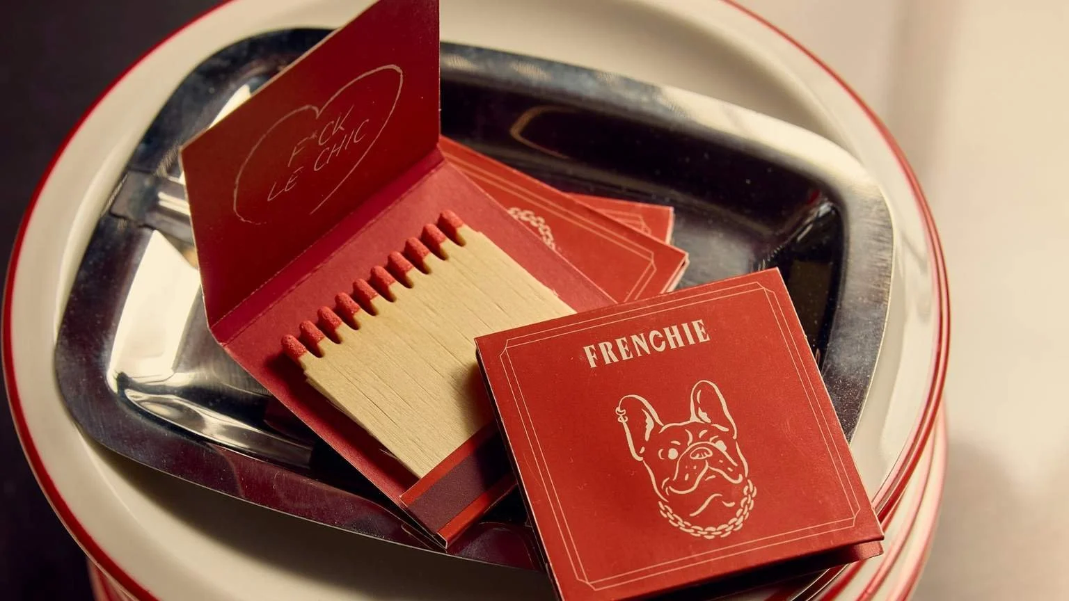
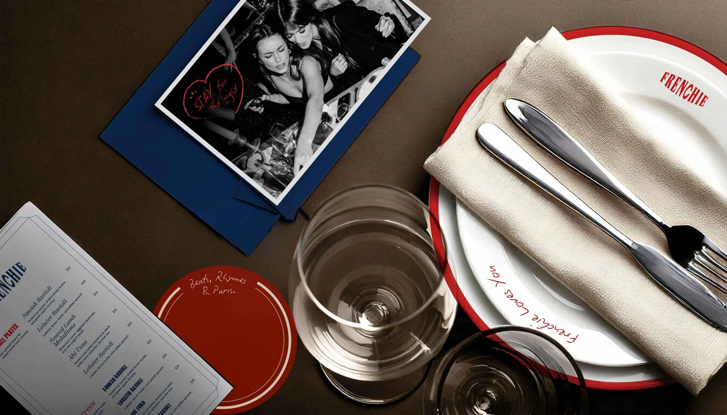
The brandmark embodies this rebellious charm. Strong, confident typography anchors the identity, while subtle Parisian cues nod to Pigalle’s neon-lit energy and the romance of French New Wave cinema. A palette of deep reds, inky blacks, and flashes of electric neon creates contrast between grit and glamour, echoing the late-night atmosphere of the space.
Graphic elements feel raw and expressive rather than overly polished. Layered textures, grain, poster-style layouts, and bold typographic treatments bring movement and urgency, reflecting the fast-paced $14 plate concept and the hum of a crowded room. There is a deliberate looseness in the composition, suggesting spontaneity and indulgence without stiffness.
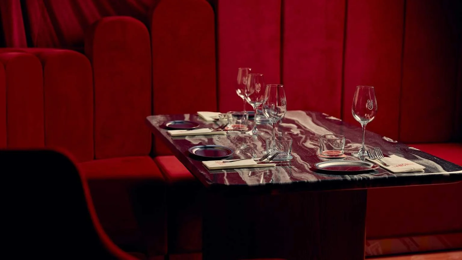
The result is a brand identity that feels magnetic. Frenchie delivers luxury without formality and Parisian attitude at an accessible price point. It is bold, flirtatious, and unafraid to blur the line between elegance and edge, capturing the essence of Midnight Pigalle in a way that feels immediate, social, and unforgettable.